All work
Case study — 06
Plume
Client
Plume Skin
Year
2024
Discipline
Brand Identity
Type
Identity & Packaging
Palette

Identity and packaging for a clinical skincare start-up that refused to look clinical. Warm minerals, tactile stock and a typographic voice that explains instead of shouts.
Plume’s formulas were backed by dermatologists, but every competitor already owned white bottles and blue sans-serifs. Trust looked identical across the whole aisle.
Warmth you can read
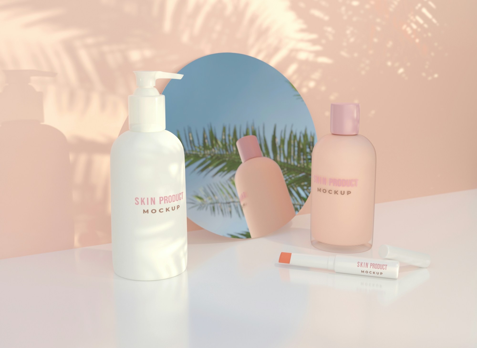
We swapped laboratory white for a family of mineral tones taken from the actives in each formula. Ingredient percentages are set large on the front, so the claims are the brand.
The packaging uses a soft-touch uncoated stock that people keep picking up in store.

Clinical doesn’t have to mean cold. It just has to mean honest.


Fig. 02 — Details from the final system.
Twelve material samples, four rounds of consumer interviews and a lot of very small type tests on very small bottles.


Plume launched online and in 60 pharmacies. The founders report that customers now describe the brand as “the kind one” — exactly the positioning we set out to own.
60
Pharmacy partners
+37%
Repeat purchase
4.8
Average rating
Creative Direction — Tomás Vey / Design — Aiko Lund / Packaging — Lea Brandt